Learn new recipes while reducing food waste
Project Type
UI/UX Course Project
supervised by Google
My Role
Product Designer
Tools
Figma
Contributions
User interview
User journey mapping
Ideation
Paper Prototype
High-fidelity Prototype
Interaction Design
Duration
February 2023 to August 2023

Quick Start
Recently, I successfully completed a UX certification program where our assignment was to conceptualize an app and website aimed at assisting individuals in reducing food waste. The mock organization we were working with recognized the desire among people to curb food waste but lacked the tools to tackle the issue effectively. To address this challenge, I reached out to two distinct groups for interviews: those already actively engaged in minimizing food waste and those interested but unsure how to commence.
How can we reduce our overall foodwaste?
Product Preview


The Challenge
Users overbuy food. You buy something and then it is buried in the fridge or the pantry. Out of sight, out of mind, and before you know it the tomatoes you bought weeks ago are in your fridge, decomposing.
According to Feeding America:
"Each year, 119 billion pounds of food is wasted in the United States. That equates to 130 billion meals and more than $408 billion in food thrown away each year. Shockingly, nearly 40% of all food in America is wasted...Food waste in our homes makes up about 39% of all food waste - about 42 billion pounds of food waste."
The Process
Through comprehensive interviews, I unearthed a common underlying issue: the need for better comprehension regarding the shelf life of various foods, both cooked leftovers and fresh ingredients, once stored in their refrigerators. I endeavored to create a user-friendly solution that allowed for an accurate and easy-to-maintain food inventory management system. Furthermore, it included timely reminders for users to consume items before they went to waste and provided suggestions on how to utilize them effectively.
When users open the application, they look to do the following tasks below (in order of importance). This information was extrapolated from a set of interviews conducted in 2023 by me.
-
Browse Recipes
-
Look at inventory
-
Restock on kitchen essentials
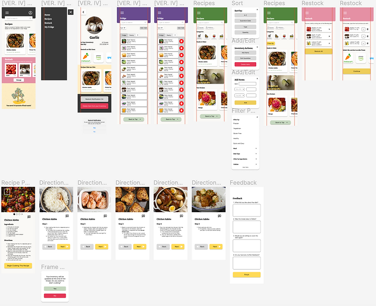
I came up with the following design based on what users needed from the application.
Initial Wireframe
After Research
Current Design, After Feedback


The Solution
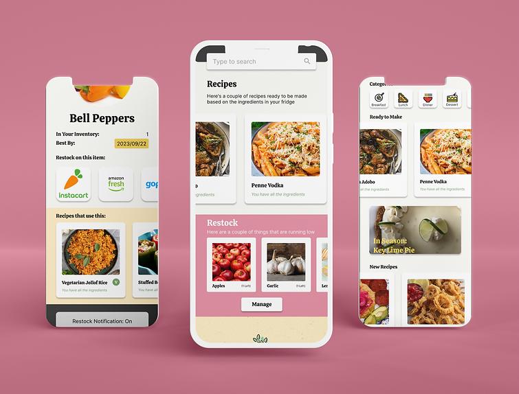
The final design that I came up with emphasized the users seeing recipes upon opening the application. The recipes are labeled as "ready to make" because the application suggests dishes that can be prepared using ingredients you already have on hand, particularly those items that need to be used promptly.


In addition, I later realized through user insights and research, that expiration dates should also be emphasized, especially if the item only had a couple of days left on its shelf life. I utilized a color scheme for ingredients’ shelf life, red indicating items for immediate use, yellow for items to be used soon, and green for those with a longer shelf life.

Major Takeaways
-
In user feedback, it was noted that the app effectively conveyed the idea that individuals could make a meaningful impact in reducing food waste. One insightful comment from fellow users highlighted that "the Food Saver app makes it simple and enjoyable to connect with environmental concerns on a personal level."
-
Through my experience, I discovered that despite tackling a substantial challenge, methodically navigating each phase of the design process and closely aligning with the unique requirements of users allowed me to devise solutions that were not only attainable but also highly practical
If you would like to check out this project, a link to the prototype can be found here.

