Centralizing the shopping experience for local plants
Project Type
UI/UX Course Project
supervised by Google
My Role
Product Designer
Tools
Figma
Contributions
User interview
User journey mapping
Ideation
Paper Prototype
High-fidelity Prototype
Interaction Design
Duration
May 2021 to January 2022


Quick Start
Canopy aims to optimize the e-commerce experience for buying plants, making it more accessible and convenient. The product addresses pain points such as the lack of convenience, accessibility, and competition from big corporations in the plant-buying market.
How can we optimize the e-commerce experience to be more accessible?
Product Preview

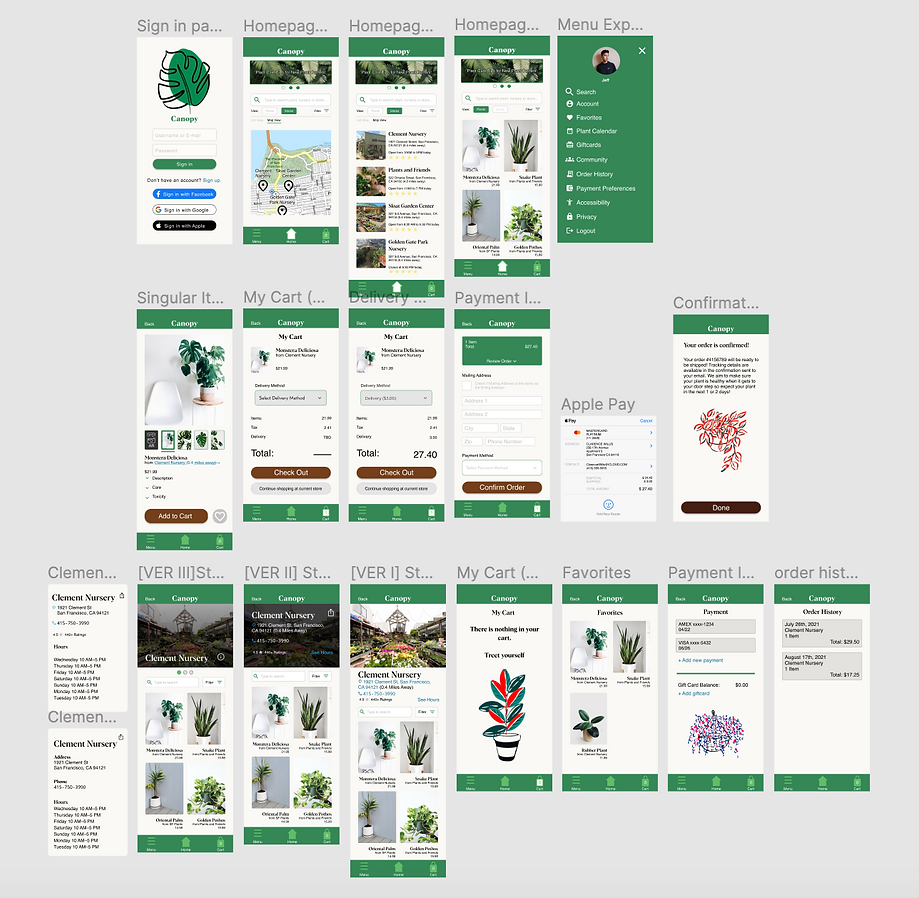
Above: Parts of the browsing and checkout experience.
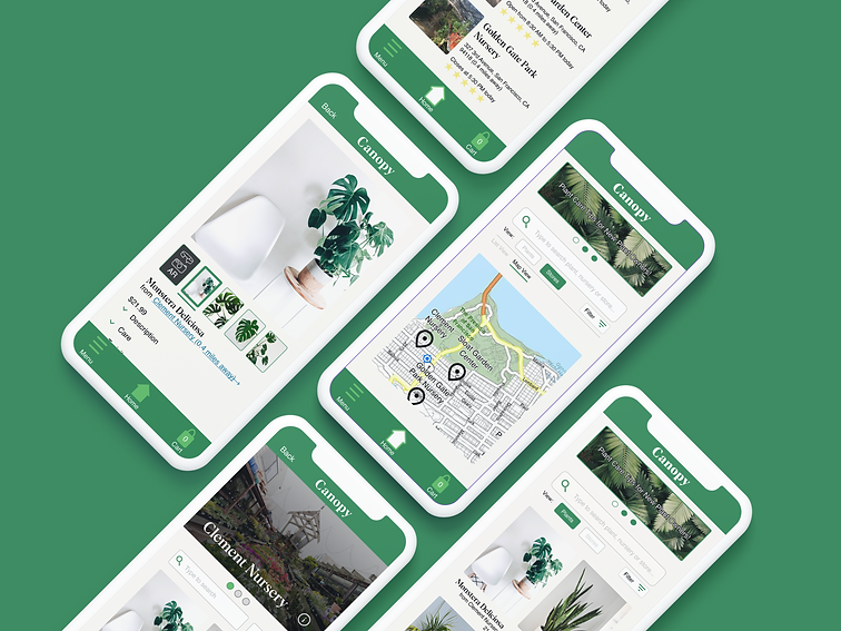
Above: Screenshots depicting different pages of the application. This includes a map view of local nurseries, store and item pages, account settings and a confirmation page.
The Challenge
Plant consumers and retailers both face issues, consumers may not be able to transport plants due to size or mobility, and retailers face competition from big businesses. Canopy rectifies these issues to allow all plant enthusiasts a streamlined e-commerce experience.
The Process
Based on the research, the pain points identified included a lack of convenience when searching for a particular plant, limited accessibility for those who may not be able to transport plants themselves, and a lack of variety in plant options available at big-box stores like Home Depot or Lowe's. To address these pain points, Canopy centralizes all local nurseries into one platform, simplifying the search process for users. Canopy also offers a delivery service for all plants, ensuring that everyone has access to the plants they desire regardless of their physical abilities. Additionally, the app encourages users to support small businesses by showcasing the stock of local nurseries and plant shops.
The Solution
After creating the personas and journey maps, the author went on to create wireframes and prototypes for Canopy, iterating on each round based on user feedback. I originally aimed to make the application easy to navigate, allowing users to browse through different stores, items, and checkout without any difficulties.
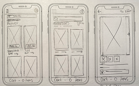
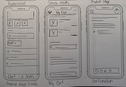
However, during the first low-fidelity usability study, two-thirds of users found navigation difficult. As a result, I made changes to button placement and emphasis and added an additional "Visit Clement Nursery" button with a defined box shape. As a result, I was able to reduce user error rates by 100%.


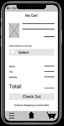
"The store button needs to be lowered down because it was too close to the camera lens"
"Wait is this the home page?"
"I think you should put a box around the text so people would know to click that."


I also learned that conducting accurate case studies is important, and gained valuable feedback on navigation and layout. They also prioritized user convenience, integrating universal payment input and adding a map feature. The author received feedback on consistency, aesthetics vs. functionality, and the importance of doing what is best for the user.
Check out the prototype in action here.
Final Solution
I began working on branding guidelines for my application. I wanted to make use of different shades of greens as it felt most appropriate for a plant app. A lot of the iconography comes from Google's material.io resources page. In order to create the final mock-up, I used Figma. The styling takes inspiration from Grubhub, Doordash and other e-commerce applications and websites.
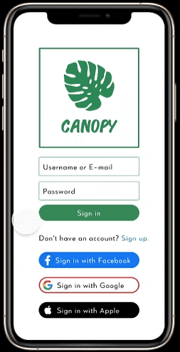
Step 1:
Sign into the application and browse.
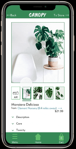
Step 2:
Add an item to your cart.
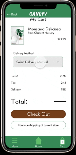
Step 3:
Complete the checkout process.
Key Feature: Universal Payment Input
Justification: Universal Payment Input (also known as "UPI") is one way to both reduce user error rates and check out faster.
Major Considerations and Takeaways
Convenience is Key

Keeping things convenient for the user will keep user error rates lower. The integration of universal payment input will reduce error rates because there will be fewer complications in inputting card information manually.

Another convenient feature I added was adding a map feature. Because Canopy helps you find plant nurseries and florists in your area, a map feature is a necessity. In the screenshot to the left, nearby stores are shown with black location markers, while the user's location is the blue marker.
Takeaways
-
Ask For Help: This was my first UI/UX project ever. I am fortunate to have many friends in the design field and they were able to give me valuable constructive feedback in regard to aesthetics, usability, flow, typography, and other various user interface features.
-
Consistency: Something that came up as I was asking for feedback was consistency. Whether it was with margins, spacing, and even the appearance of the icons I was using, it is important that similar features on different pages appear consistent. One piece of feedback I got during my first usability study was that some of the icons used throughout the design did not look like they came from the same design system.
-
Functionality Over Aesthetics: As a former art teacher, I really value aesthetics. But UI/UX is not just about aesthetics, it is about the user and the functionality. So even if I am a fan of a certain feature or look, if it does not work for the user then I have to do what is best for the user. For instance, I really wanted to use a leaf instead of a chevron for the back button. However, the use of a leaf could be confusing or misleading so I opted for what is best for the user in the final design.
If you would like to check out this project, the link to the prototype can be found here.
